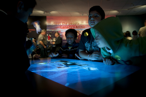
Designing for Multitouch Tables and Surfaces
We’ve spent a good chunk of the past two years developing multitouch tables and tabletop exhibits. While multitouch tables are often the first choice for museums and collaborative spaces, designing exhibits for collaborative tabletop spaces presents a unique set of design challenges. Many first-time tabletop designers (including us!) make the same mistakes when designing such interfaces, as the majority of interactive and web-based exhibits up to this point have been single-user, handheld or kiosk devices.

A few things we’ve learned:
1)Don’t forget that the table is omni-directional.
On handheld devices, you can count on the user viewing the screen from a certain perspective, so you can anchor your navigation bar and other elements accordingly. On tables, visitors can approach from any side, so it’s important that the interface compensate. Making elements rotate can be a good way to compensate for this. Navigation elements can be made to “float” so that they can be moved and rotated also or mirrored on both sides of the table to ensure visitors have equal access. If you do decide to make a table exhibit strongly directional, make sure its placement in the gallery encourages visitors to come up to the right side.
2) Individual control of objects encourages multi-user interaction
To make an exhibit truly multi-user, it’s important that several people can participate at the same time. We’ve found that creating multiple objects that visitors can control individually promotes simultaneous interaction. Many of our exhibits use image and video objects that can be zoomed, dragged, rotated, and flipped to reveal more information, and this type of object will be available as a module when Open Exhibits core is released! But the principle can be extended to any type of object, as long as applications also . . .
3) Promote collaboration (founded in healthy competition)
Some objects, especially ones that affect the entire interface (the orb that allows you to change the map view in our mapping applications is a good example), will need to be unique to prevent visitors fighting for control of the interface. We’ve found that including one or two unique objects promotes collaboration due to, not in spite of, the scarcity of the objects. And making such elements dynamic (draggable, rotatable, etc.) makes sharing easier from a practical standpoint. We’ve seen visitors politely ask for control of the magnifier that we built for Oakland Museum or silently pass it to a new arrival. The fact that there is a small amount of competition for the solitary control object encourages visitors to interact with each other as well as the exhibit.
Learn more about our interactive exhibits by reading our case studies on ExhibitFiles.
by Erin Rose ![]() on October 11, 2010
on October 11, 2010