Using Agile Development Tools to Inform Exhibit Design
 We’ve been reading Nina Simon’s post on A/B testing in museums (where two different setups of the same exhibit or exhibit element are put on the floor and compared). She talks primarily about conceptual or physical design elements (note cards, question structure) but we started thinking about this kind of testing and computer-based exhibits.
One problem museums can face when trying to implement A/B testing or another type of exhibit testing is that development of distinct exhibits can be very expensive and time-consuming, and spending a large chunk of money for what is essentially a prototype can be a deterrent. We generally try to make our exhibits easily modifiable via an external file, so that the application can be easily changed without an expensive secondary development process. And we’re carrying this one step further with Open Exhibits by offering the software and knowledge base for free, to make iterative exhibit development easy and cost-effective and to allow exhibit designers to learn from one another in the same way that programmers do.
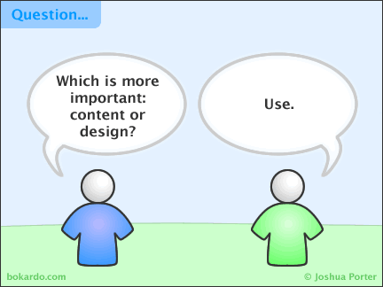
In software design, this is a technique that is part of “agile development.” Program structure grows out of trial-and-error. And actual use. By actual people. A big mistake in almost any of kind of design is assuming that because a program (or exhibit) has the functionality and content that the designers wanted to put in there, and there are no obvious gaps or bugs, then it works. Which is very, very wrong. If the software or the exhibit doesn’t encourage the user to interact in straightforward, functional ways, most won’t sit there and muddle through it. They won’t spend five minutes pressing buttons on the interface to figure out how to read information about one dinosaur. They won’t write a detailed response to a question with a tiny annoying golf pencil that is hard to hold. They will leave.
And if you design interfaces that are easy to change and modify without throwing the whole thing out, it’s much easier to learn from the weak points in a design and alter them to make the final product stronger. Flexibility is an essential component of effective design and development. It allows exhibit developers and software designers to easily change and test elements with little to no added cost, giving museums the ability to experiment and test interfaces, rather than having to take a potentially expensive chance on custom-built software or defaulting to the tried-and-true.
As Open Exhibits progresses, we hope that it can serve as a sort of virtual A/B testing, with multiple users letting us know what did or did not work for them with existing applications AND being able to build and test modifications to those applications, or build an application from scratch, to create effective and enjoyable exhibits.
If you have any tips on interaction design, feel free to write a blog post for Open Exhibits (just click the share tab!). We’d love to hear your thoughts.
Comic by Joshua Porter
by Erin Rose ![]() on December 10, 2010
on December 10, 2010