Building a Better Collection Viewer
(You might want to see a new post on this topic: updated October 3, 2011)
Our Collection Viewer software is a multitouch-enabled media viewer that can display images and video from local files or from Flickr or YouTube. It is unique in that it was the first multitouch enabled viewer to display metadata such as: title, description, author, and copyright information. (Most multitouch-enabled image viewers still don’t allow you view any associated metadata including Microsoft’s Surface Collage software.)
While the current Collection Viewer is great for viewing small sets of media, it doesn’t provide the ability to browse, search or connect to larger museum collections. These sound like simple and obvious add-ons, but if you are looking to build in the ability to search on multiouch table; you need an onscreen keyboard. If you want to create the ability to browse collections, you need to develop tools that work in a collaborative, multiuser environment. The technical aspects are relatively simple. The design questions are new and challenging.
The new version of the Collection Viewer will be very flexible and it will be able to connect to a variety of collections managment tools. It will be fully customizeable and work on multitouch tables and walls where multiple visitors interact simulataneously. We’ve begun to mock up some user interface elements and we are just starting the conversation with our museum partners as part of the redesign process.
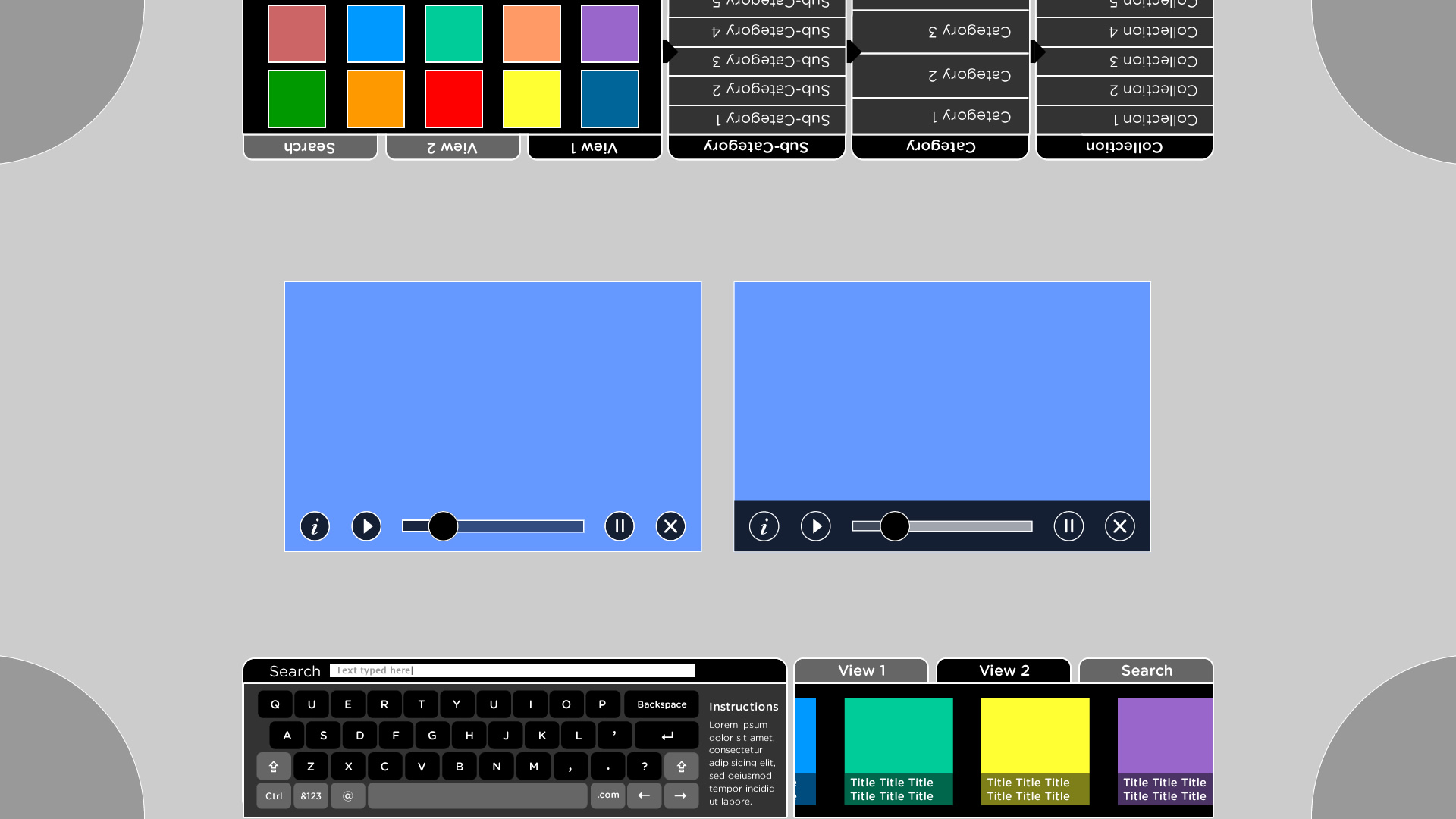
The wireframe below is designed for a 1920 x 1080 HD screen. Notice we have ways to browse and drill down to images within subcategories, allowing for acess to large collections. We have also have designed a basic “mobile-like” keyboard for searching. All of the interface elements would be editable and controllable via XML. This would allow the new Collection Viewer to be used in a variety of ways and settings. The quarter circles in the corner may eventually become a way to save or share or print images from the collection.
Also, new in this version, we are also planning on moving the styling into CSS. This feature would provide even more flexibility for skinning the application. In addition, we are exploring options for “real time” styling.
In working with our museum partners we hope to further our designs with real collection items and feedback from them and their visitors. In addition, we are planning on simplifing the process for adding local collections items and metadata (not all parts of all museums are wired). We intend to connect to Omeka based online collections. Our partners at the New Mexico Museum of Natural History have a preliminary Omeka test-bed of fossils see: The Rise of Mammals.
Where we go from there is still an open question and things could change as we enter the design process. We will be rolling out new versions of the Collection Viewer with new features later this fall. We welcome your comments and questions.
by Jim Spadaccini ![]() on September 13, 2011
on September 13, 2011
